

Case study
LcL: brand and UX for a Vienna language school
The context
The context
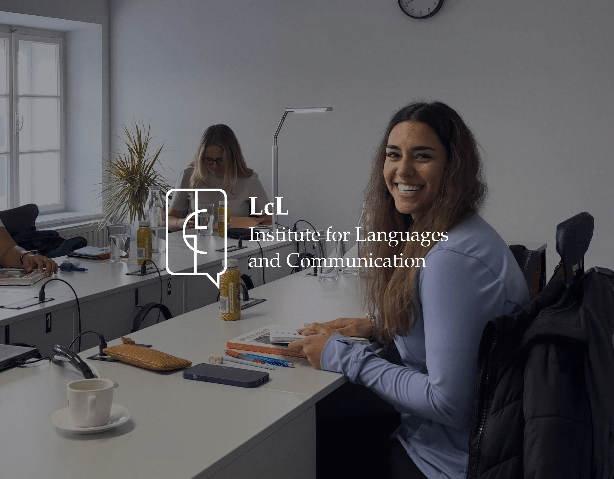
LcL is a Vienna language school teaching German, English, Spanish and other languages. Its founders came to us in 2022 with no logo, no website and a broad idea of what the school should be.
The offer was wide from day one: group and one-to-one courses, in person and online, specialist classes, workshops and language camps. The challenge was to make it easy to find your way through.
What we did
What we did
01
Strategy workshop
User personas, the platform's functions and how to present the course catalogue.
02
Information architecture and user flows
Mapped first, then tested on low-fidelity mockups.
03
Early usability testing
Assumptions checked with users before any visual design.
04
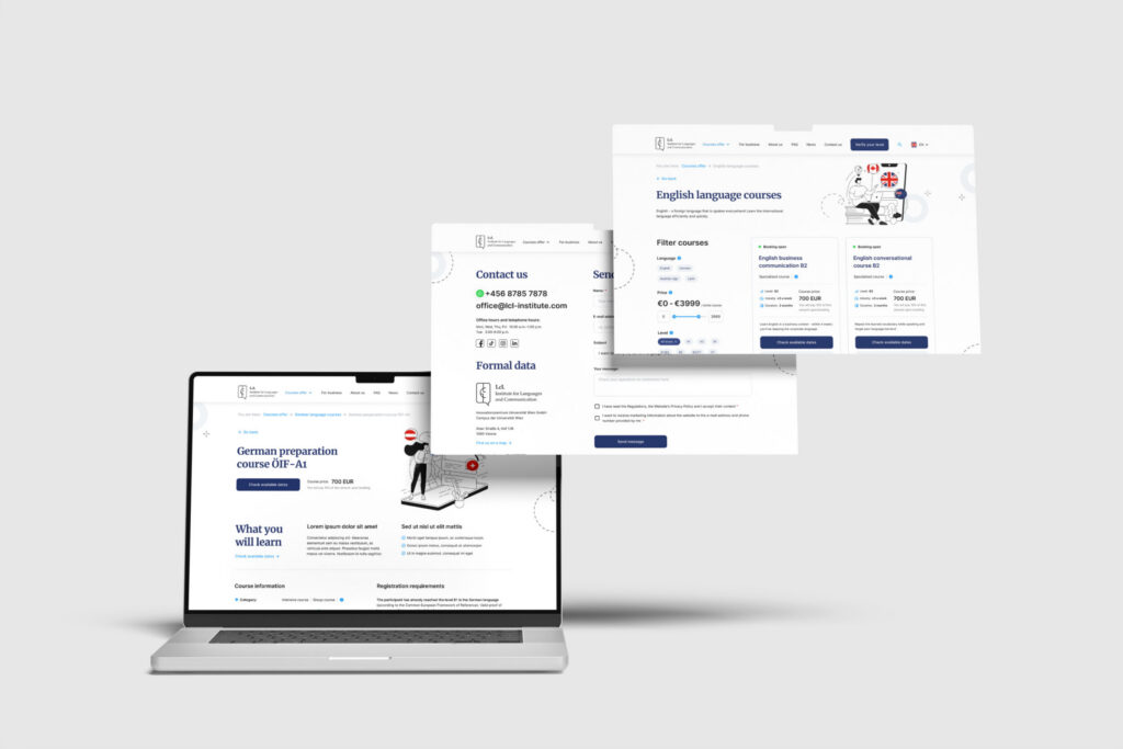
Interface design
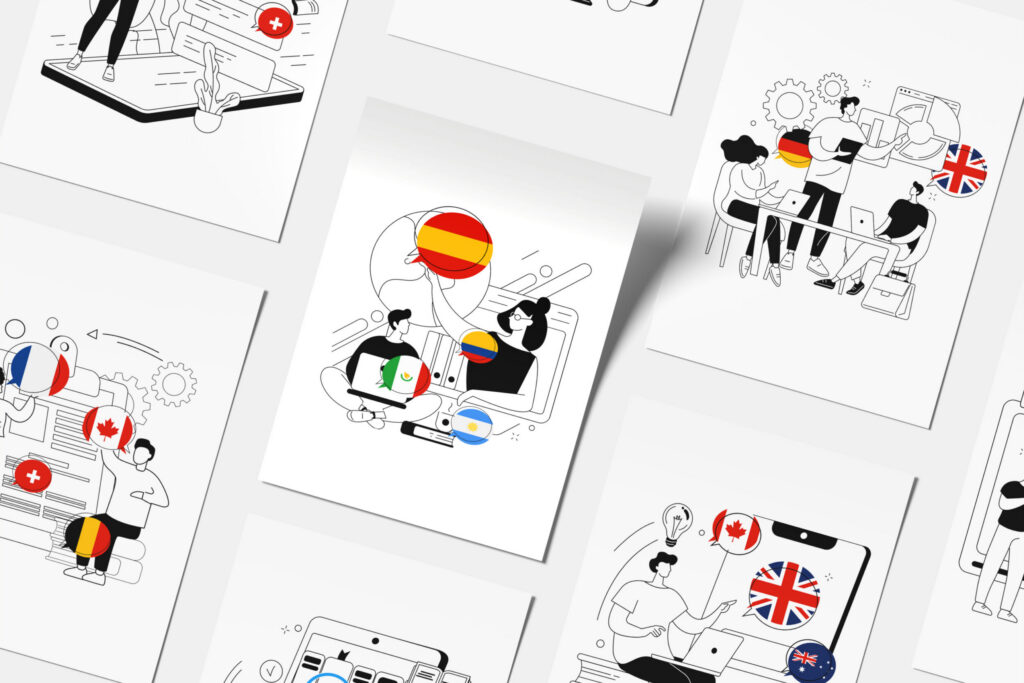
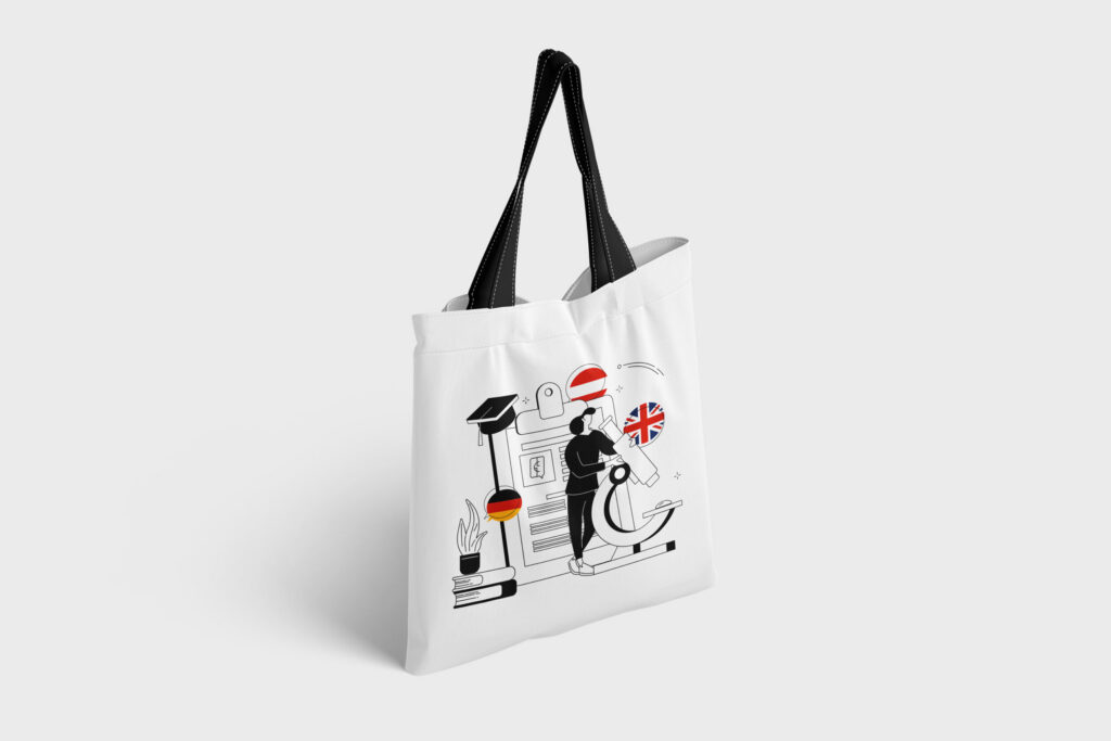
A clear layout with a strong information hierarchy and a line-art illustration system.
05
Logo and identity
An LcL monogram set in a speech bubble with an open book: conversation and learning in one mark.
The work
Selected work
Website, logo and identity
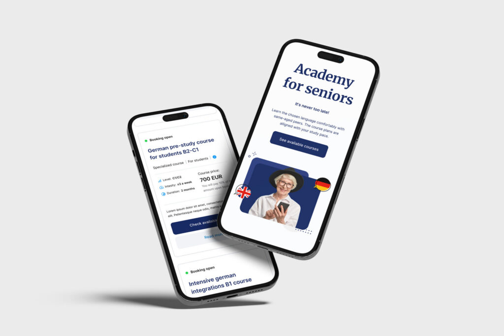
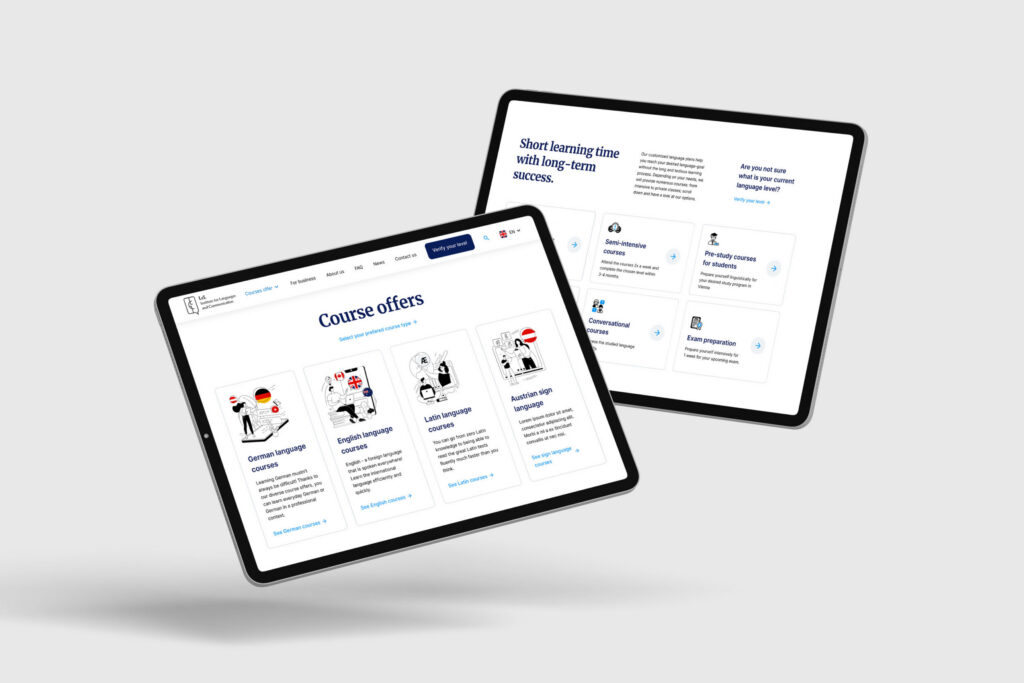
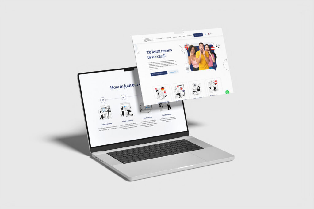
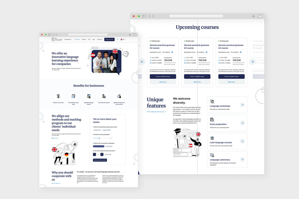
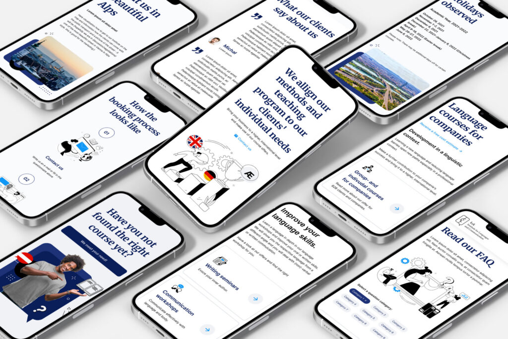
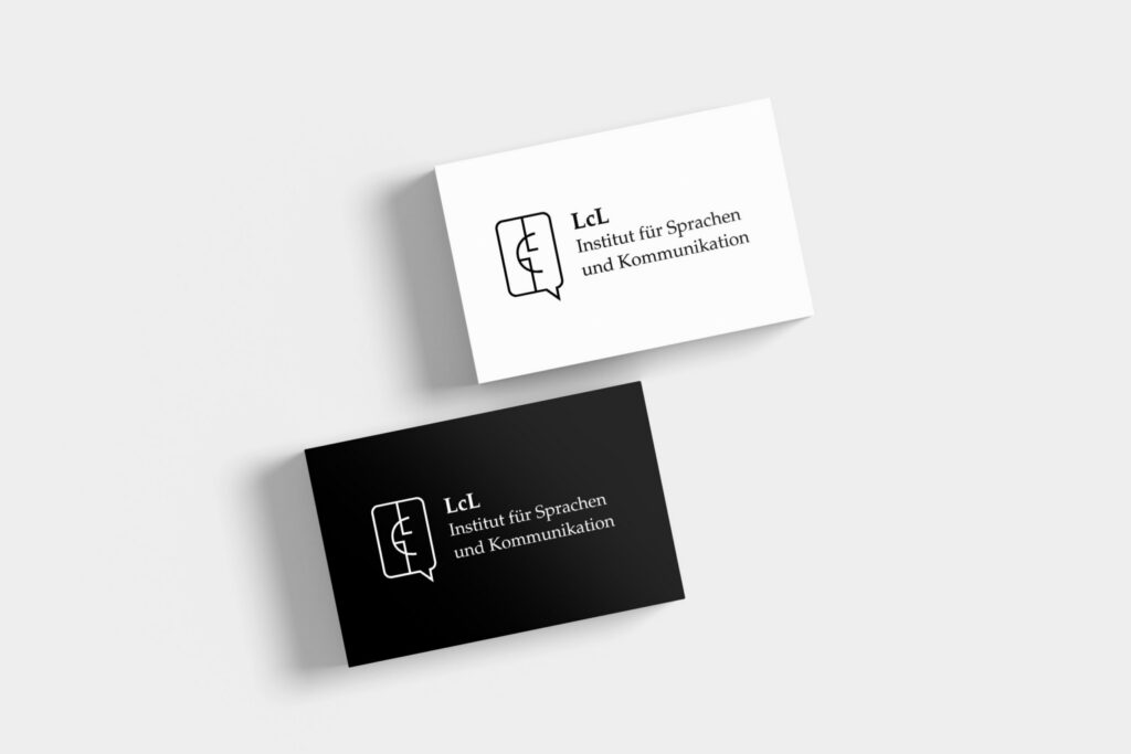
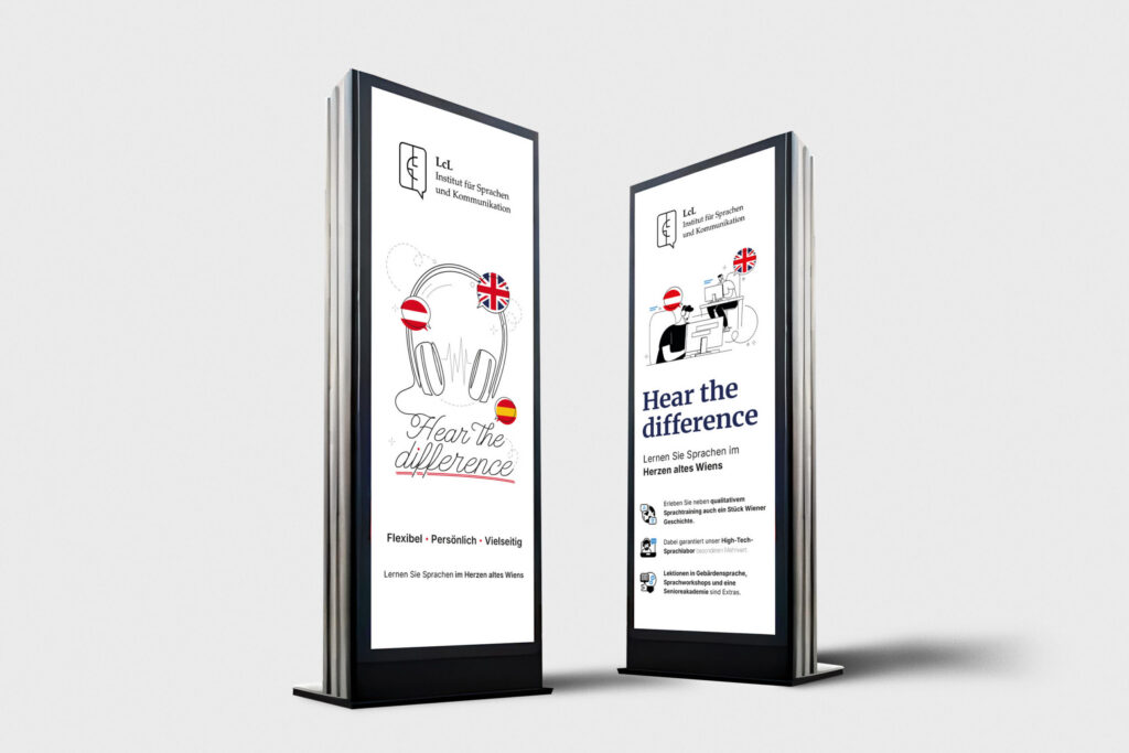
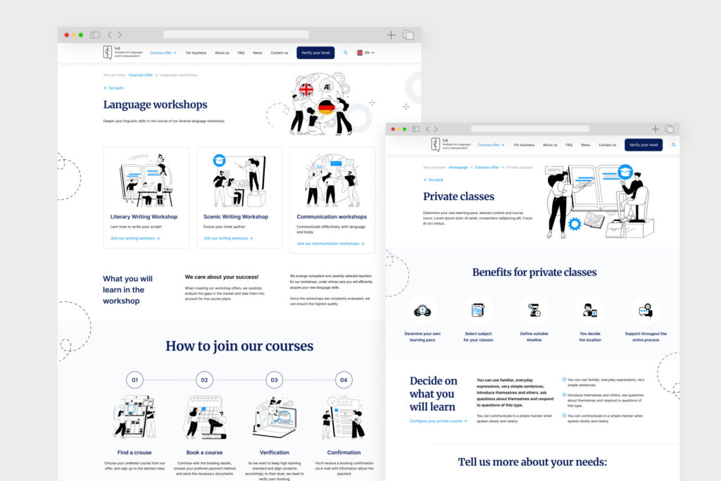
The outcome
The outcome
We handed over complete design documentation and LcL built the site in-house. The school still uses the logo, identity and interface we designed.
6
months from workshop to handover
75+
students since the school opened
5
languages on the timetable
Start here
Want something similar?
A short brief is enough to start the conversation.
We usually reply within one business day.
Where are we
Poznań, Poland
Working Hours
09:00 – 18:00 Poland time
Working language
English / Polish