

Case study
JAVA Coffee Roasters: a mark for a brand that wasn't meant to change
The context
The context
JAVA Coffee Roasters has been roasting specialty coffee in Poland for over twenty years. To sell abroad, the company needed a registered trademark. The Polish Patent Office had doubts: “Java”, “Specialty” and “Coffee Roasters” describe the product, and The Java Coffee Company already operates in Belgium.
The logo needed an element that could be protected. At the same time, the brand’s minimal style had to stay, and regular customers weren’t supposed to notice the change. The new logo was never implemented: the project ended at the concept stage.
What we did
What we did
01
Analysis of the objections
We worked out what exactly blocked the registration and what the change had to address.
02
Looking for inspiration
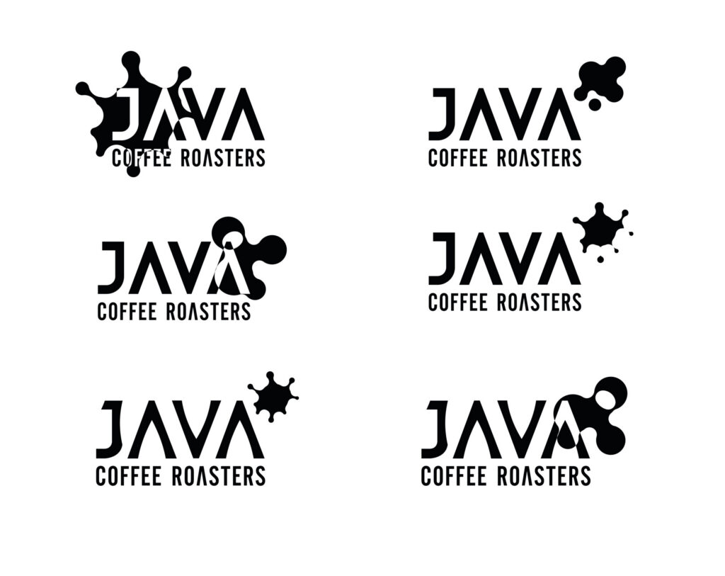
Batik, Javanese script, traditional dance, volcanic plantations on maps. We tested each lead on the letters of the wordmark, over several rounds with the client. From the start, every direction assumed a mark that could change and move.
03
A drop of coffee
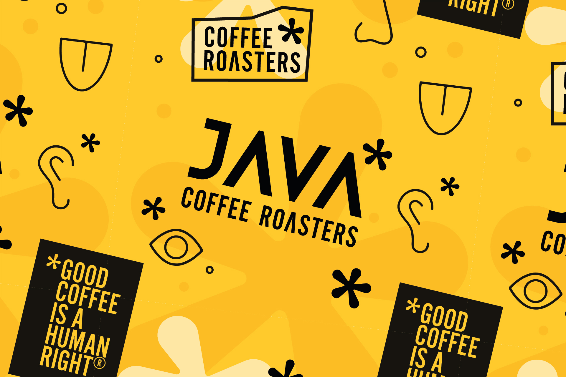
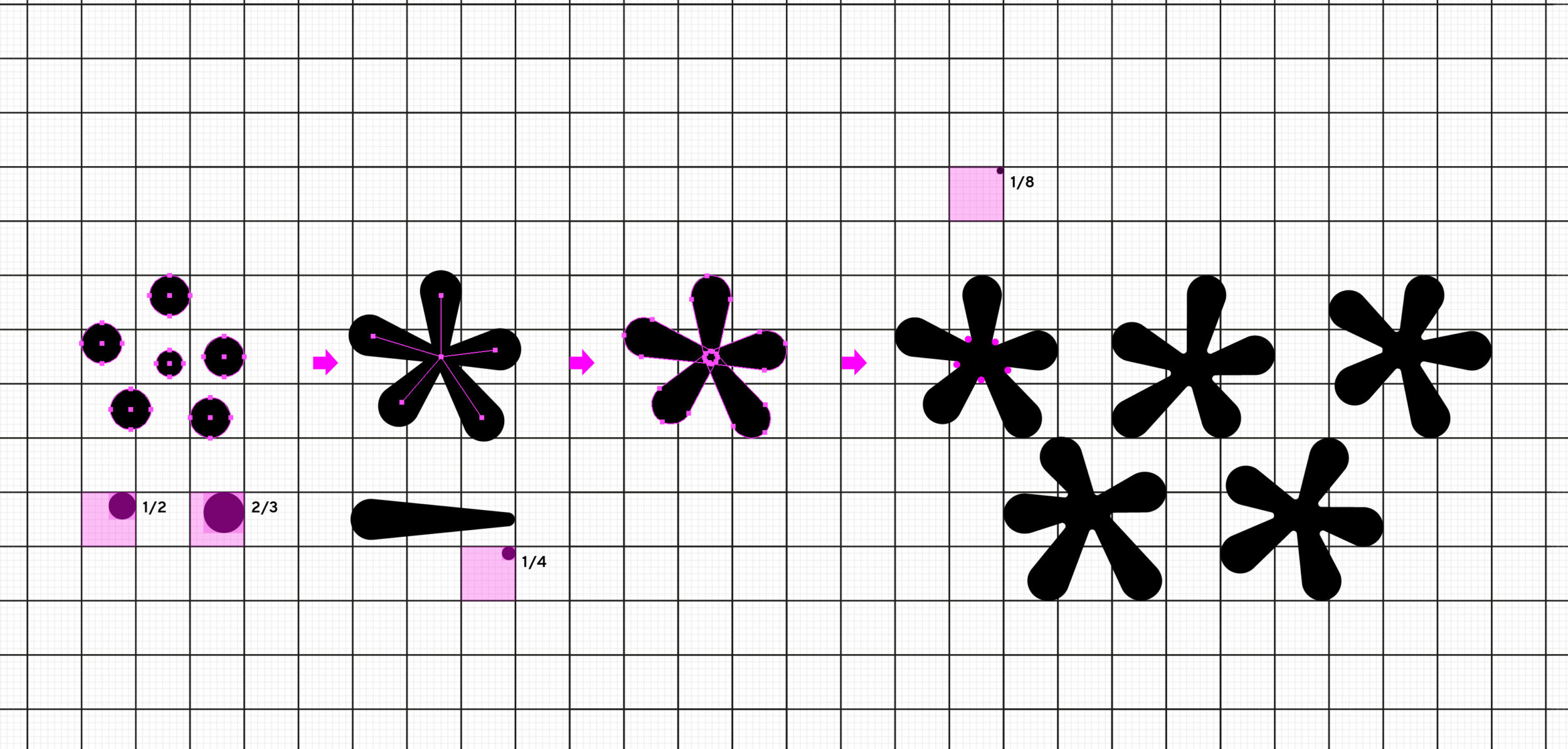
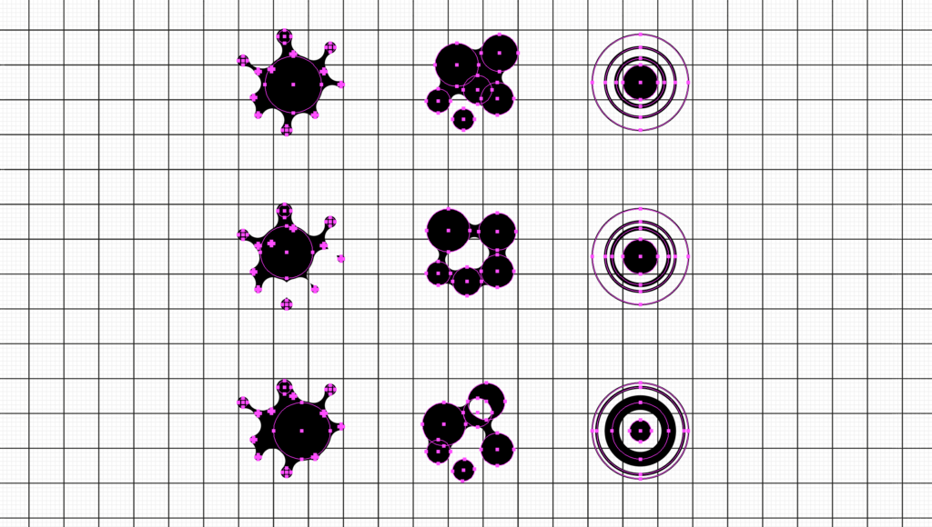
Instead of the island, we looked at the coffee itself. A drop of espresso seen from above became an asterisk. Its arms can stretch, rotate and move, so the mark can change shape and be animated while staying recognisable.
04
One grid
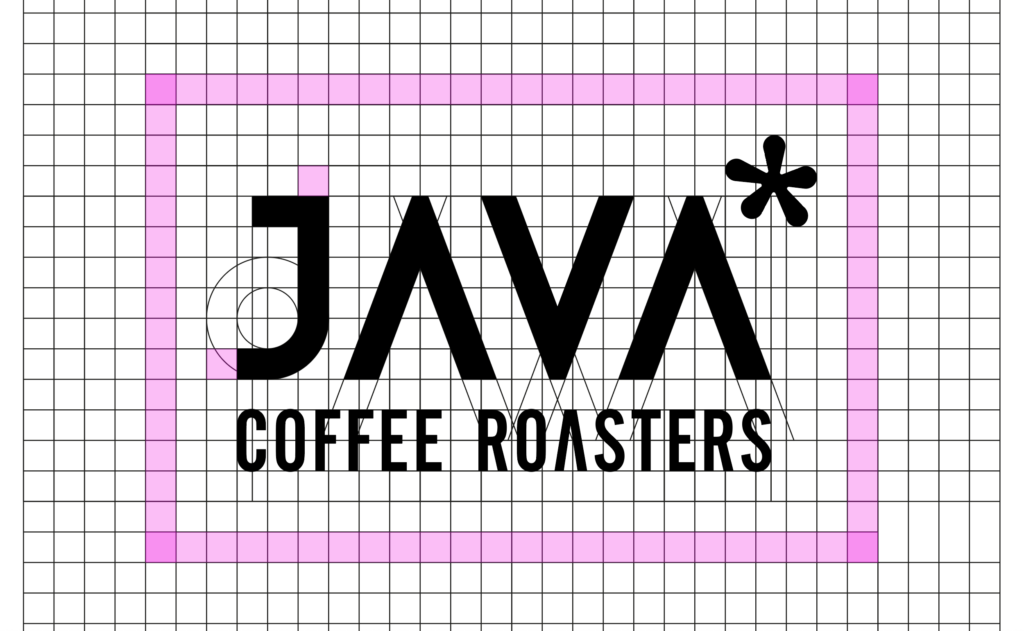
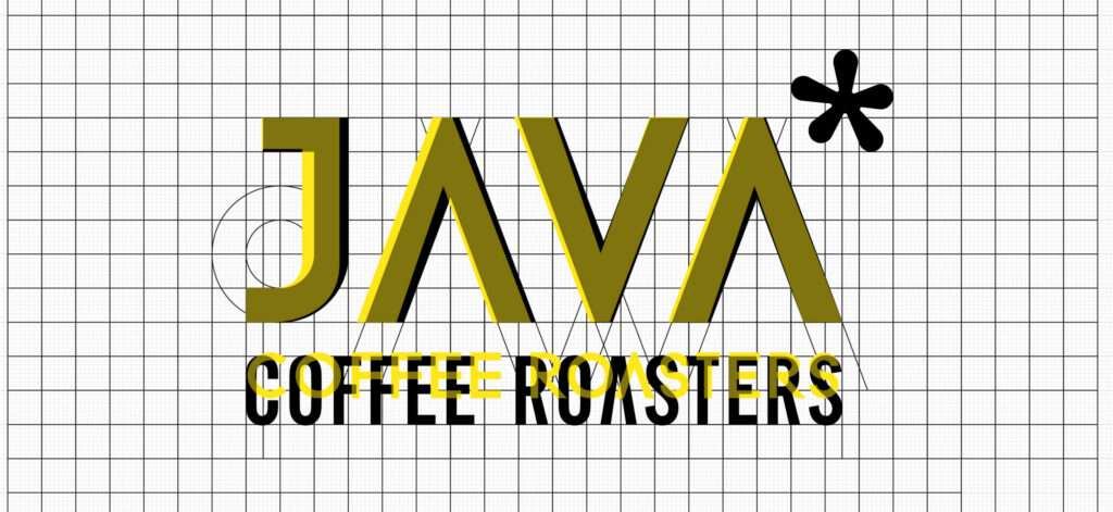
We redrew the wordmark and built the asterisk on the same grid. The letters changed so little that the difference is hard to spot.
05
The brand in use
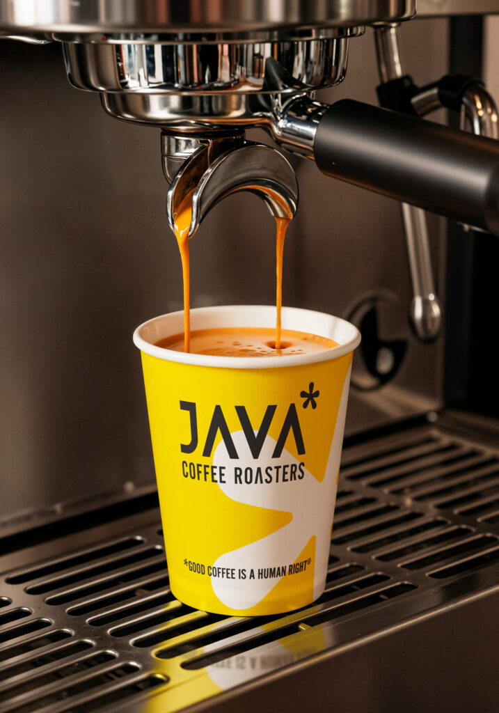
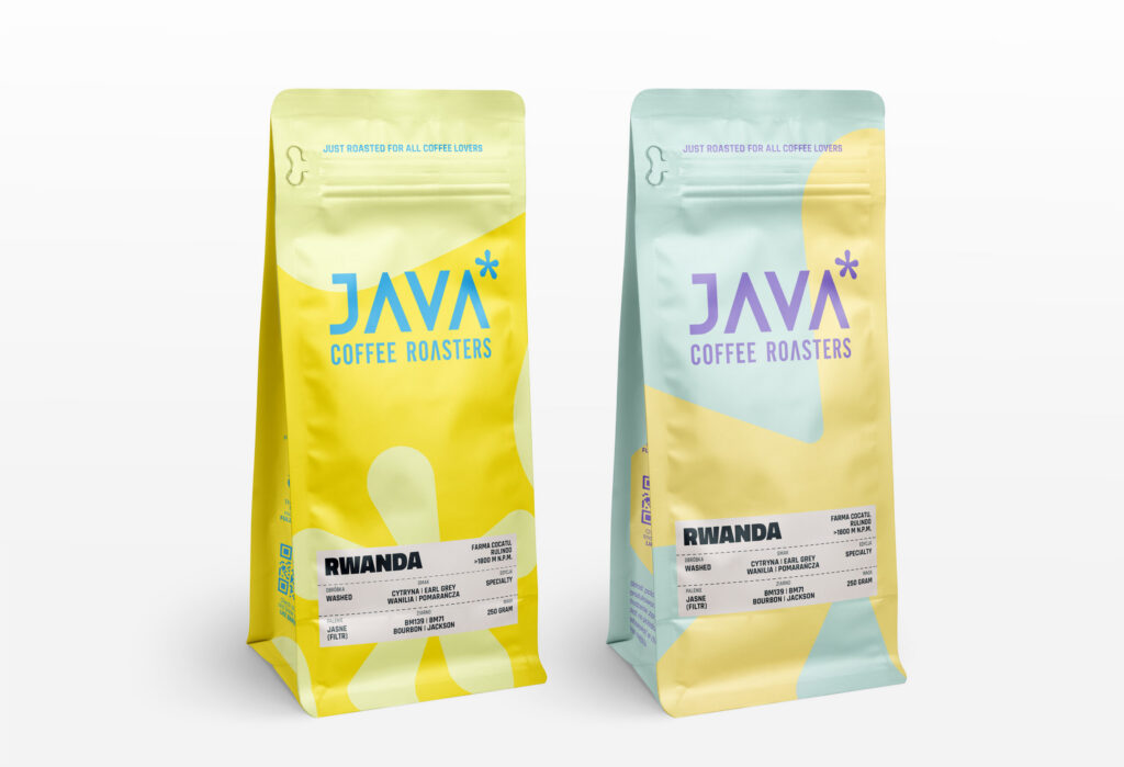
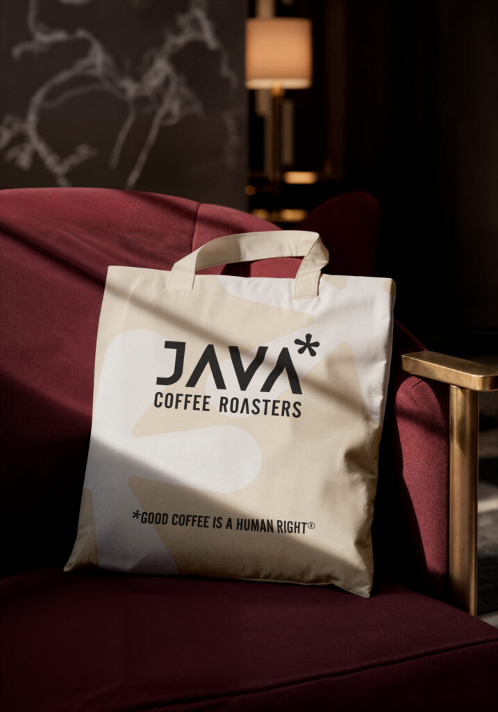
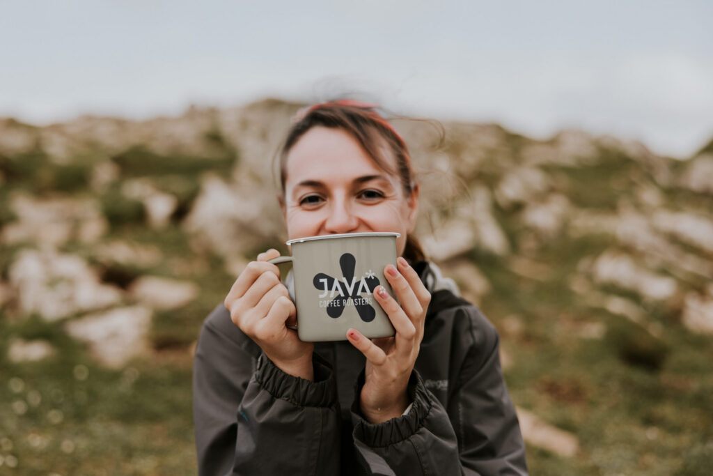
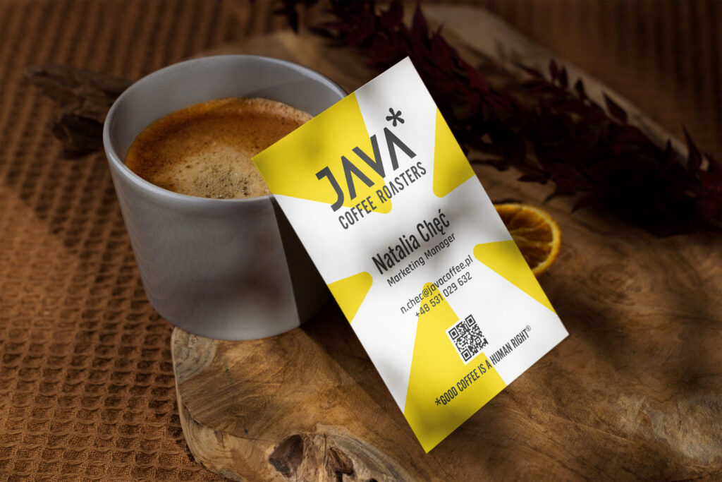
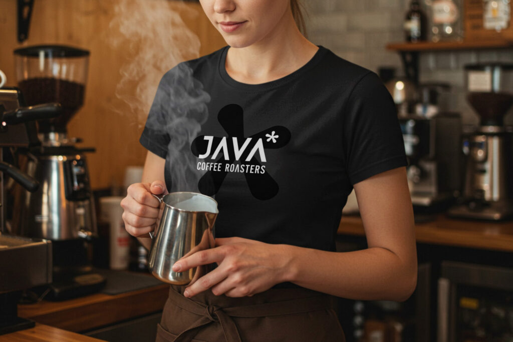
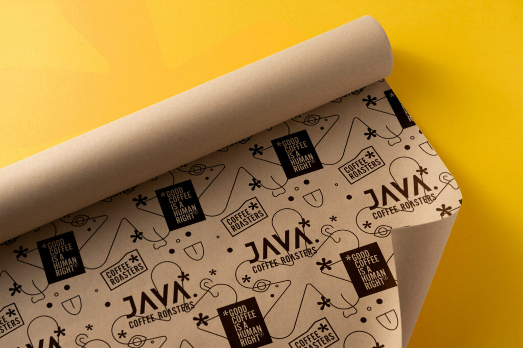
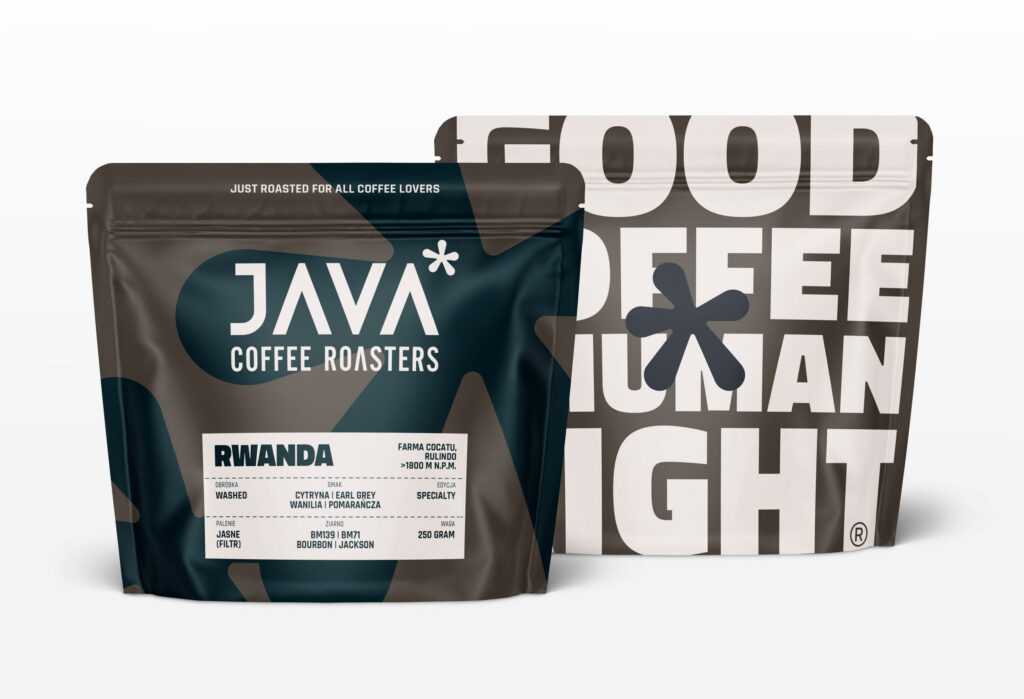
Packaging, cups, bags, patterns, business cards and a logo animation for the website header, so the client could judge the whole brand, not just the logo.
06
Letter to the Patent Office
We wrote the justification ourselves: why the new mark is distinctive and how it differs from earlier marks.
Animation
Logo in motion
Logo animation in the website header
The work
Brand presentation
Concept visualisations
The outcome
The outcome
After consulting the Patent Office, it became clear that the name itself was the obstacle. It is too descriptive, and a new graphic element wouldn’t change that. Without a chance of registration, refreshing the logo no longer made sense, and a full rebrand wasn’t the right step for the company at that stage. JAVA kept its current logo.
Start here
Want something similar?
A short brief is enough to start the conversation.
We usually reply within one business day.
Where are we
Poznań, Poland
Working Hours
09:00 – 18:00 Poland time
Working language
English / Polish