
Case study
Apigen Royal: packaging for bee venom cosmetics
The context
The context
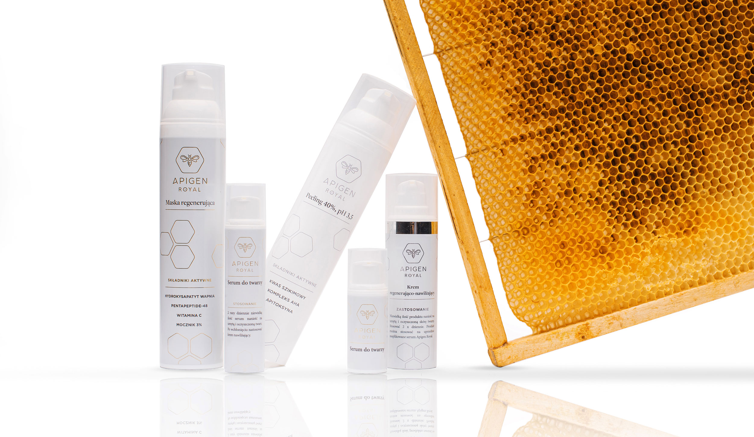
Apigen Royal makes skin care based on bee venom, developed after years of research into how it affects the skin. The formulas are 99% natural ingredients. As a new brand it needed a logo and packaging that would feel premium and carry the science.
We designed both, and the client's openness to ideas led to several more projects.
What we did
What we did
01
Logo
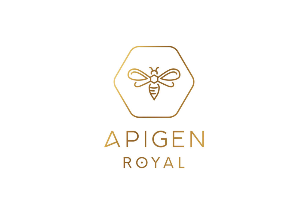
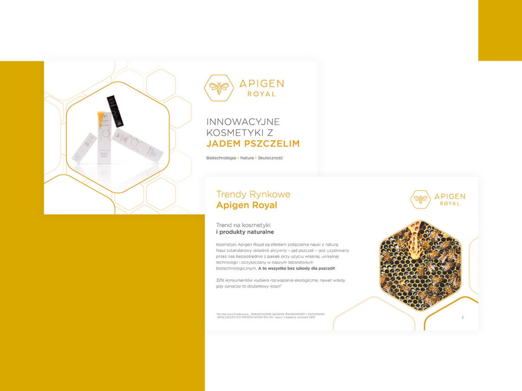
A bee in a hexagon: a sign that links the brand to bees and to the precision of science.
02
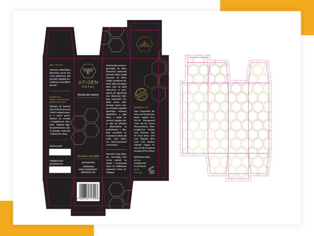
Packaging
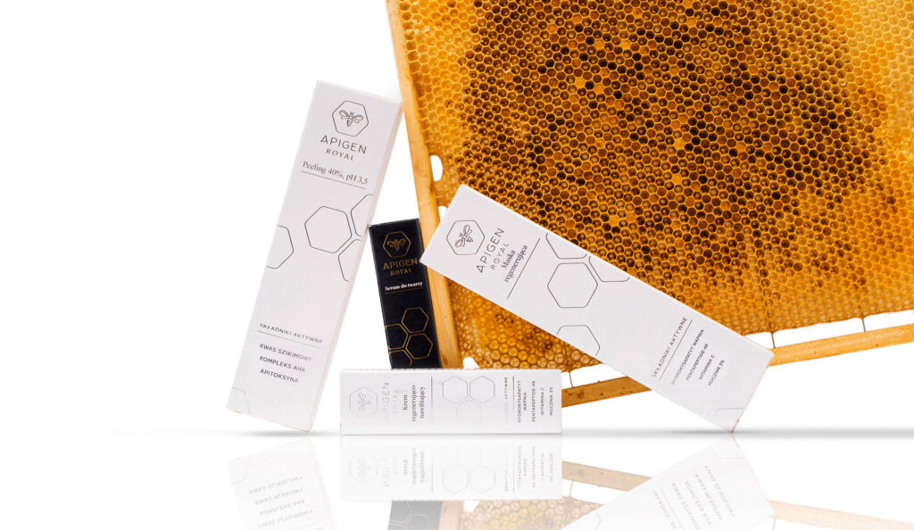
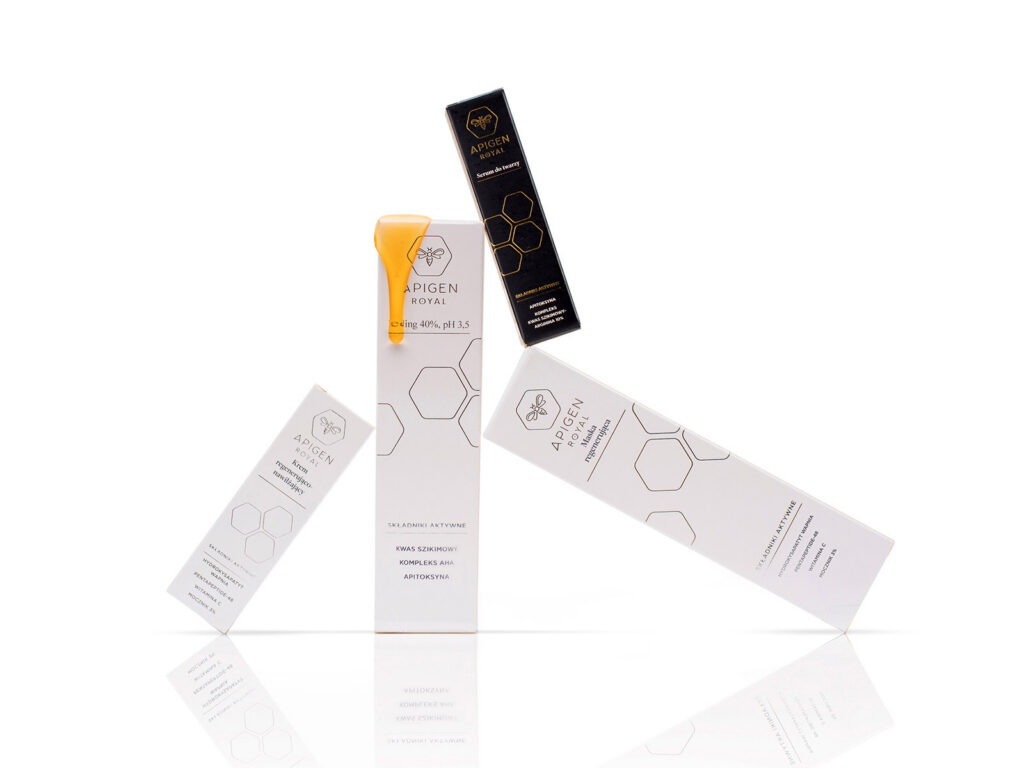
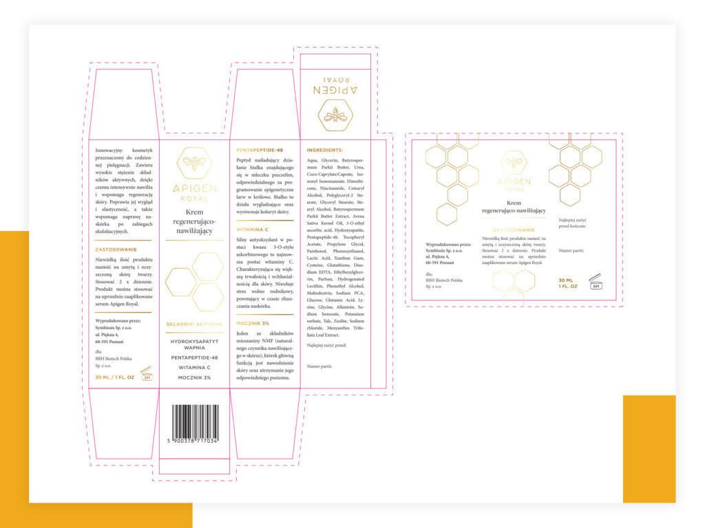
White and black boxes with a honeycomb pattern, from the first dielines to print-ready files.
03
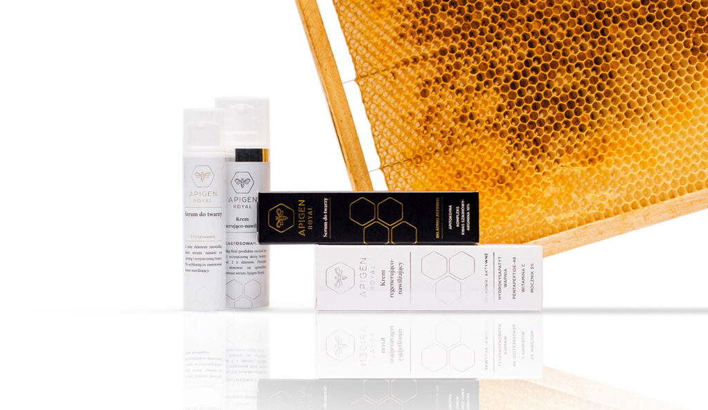
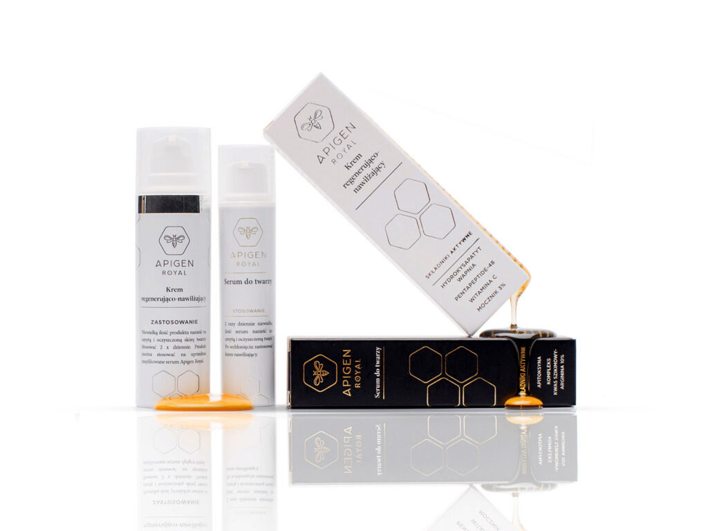
Product photo shoot
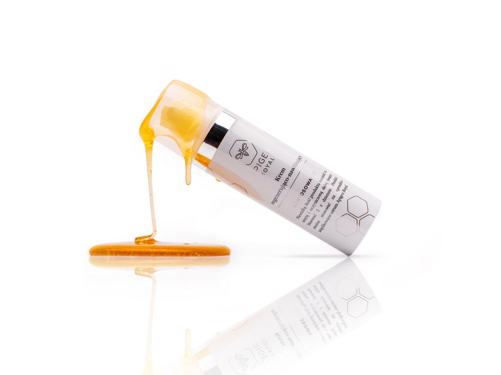
The products at their best, with a nod to bees.
04
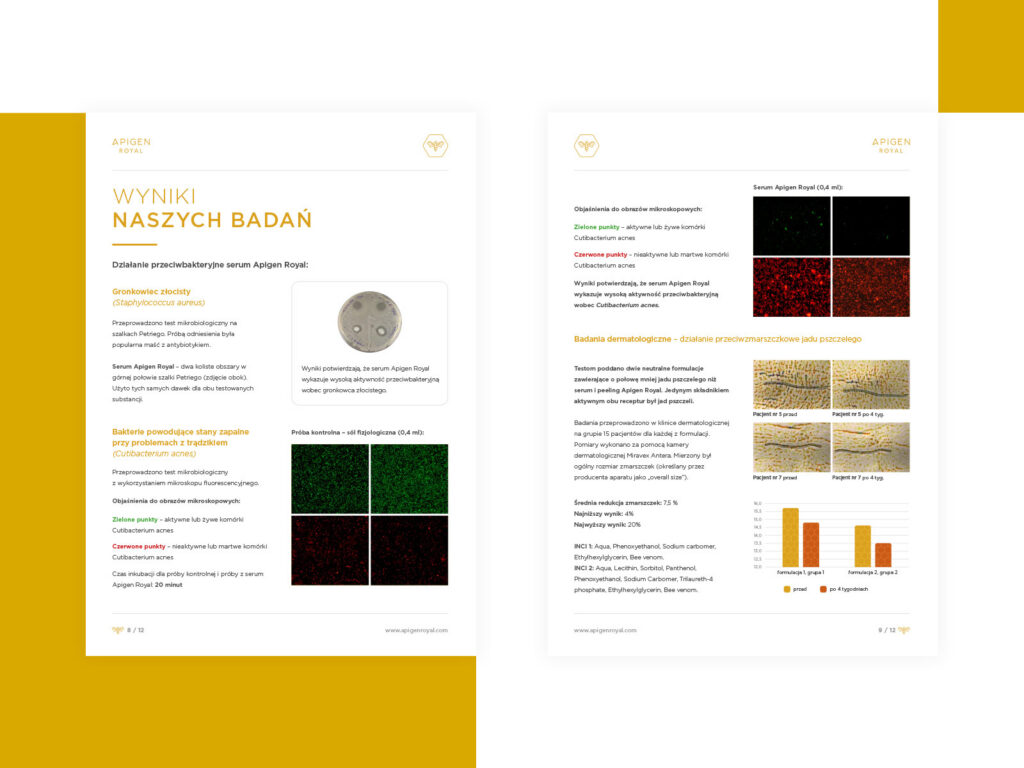
Printed materials
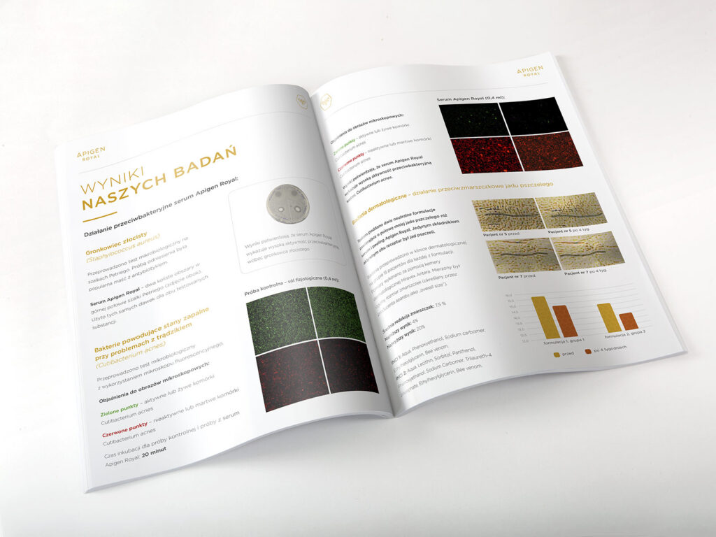
A brochure with the brand's research results and a product leaflet for the market launch.
The work
Selected work
Logo, packaging, photo and print · Photos: Kuba Konwent
The outcome
The outcome
Apigen Royal entered the market in 2018 with a complete set of brand materials, from logo to product photography. The logo and packaging system are still in use today, across the whole product line.
2018
brand launch
7
packaging designs
4
products in the line
Start here
Want something similar?
A short brief is enough to start the conversation.
We usually reply within one business day.
Where are we
Poznań, Poland
Working Hours
09:00 – 18:00 Poland time
Working language
English / Polish